2018 WCC logo design creates firestorm
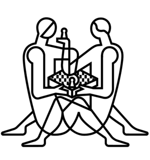
We’ve all heard the numerous puns concerning chess. They dot the tournament halls on t-shirts and many are very catchy and humorous. In this season, we will hear blitz players sing any number of holiday songs adapted for chess. Instead of “chestnuts roasting on a open fire,” my high school coach used to sing “backward pawn on an open file.” Everyone has a pun about Nat King Cole’s classic, “The Christmas Song.” There is the immortal joke about “chess nuts boasting on an open foyer” and of course the ubiquitous and worn pun, “chess players mate better.”
One may quip that this is what was intended by AGON who is now ramping up publicity for the 2018 World Chess Championship next year in London, England. What has created buzz is not the impending Candidates tournament in March to determine who will face Magnus Carlsen, but the logo that has been designed for the match. While it may delight abstract artists and hardcore impressionists, it has fallen flat in the eyes of chess players and non-chess players alike. Susan Polgar and others posted the imagery on Facebook fueled a firestorm… and a few “pawnographic” chess puns.
The above logo is translucent and the images are not well-defined, but when you add color and texture, it becomes more apparent where the controversy lies.
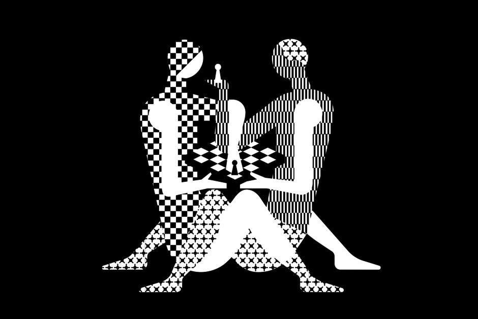
What-were-they-thinking? AGON described the logo as ‘controversial and trendy, just like the host city.’ Is that supposed to flatter Londoners? Social media has blasted the decision to put what some refer to as a Kama Sutra imagery within the logo. The overwhelming consensus… the logo sucks. It not only sucks, but… it f*%ks!??
There was a provocative article titled, “New World Chess Championship Logo Says, ‘Hey, Let’s F*%k’.” OK… I censored the titled, but Emma Baccellieri has an interesting analysis of how much sex each chess piece is having. It is done in complete mockery. One thing for sure is that this logo is bringing out the creative juices in us all.
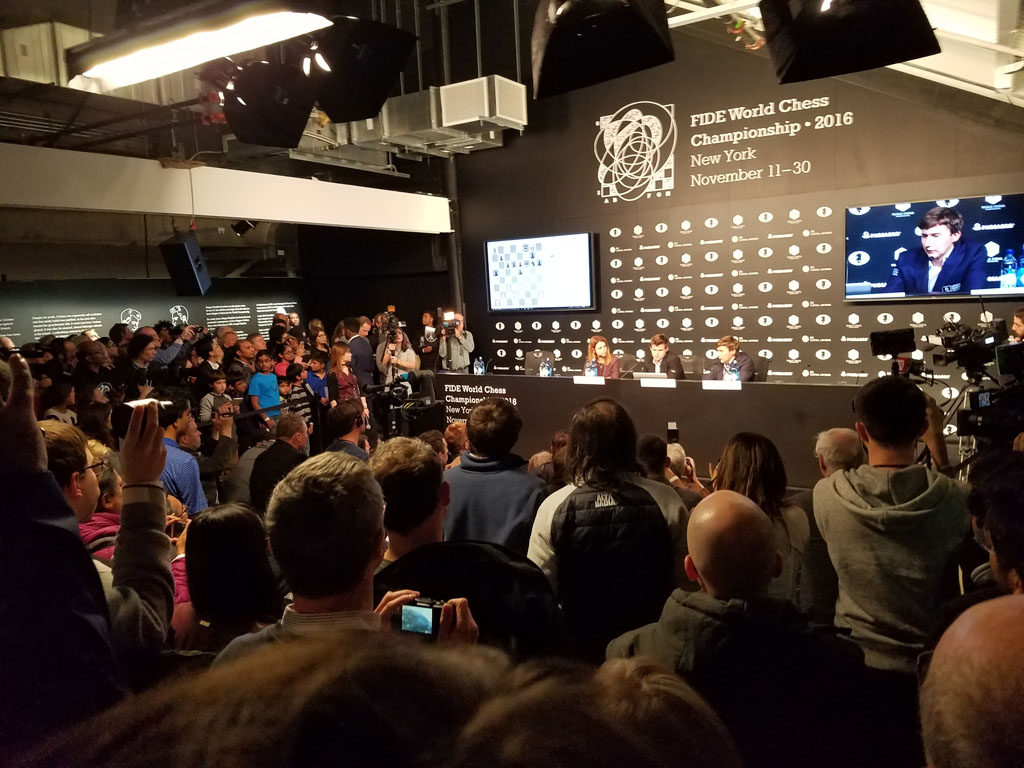
Press conference after Carlsen’s win in the 10th game of the 2016 match against Sergey Karjakin. Notice the logo at the top done by the same Russian company, Shuka Design. It is an abstract version of a chess board, but would the newly-designed logo be as media friendly? Photo by Daaim Shabazz.
I attended the last championship match in New York and it was in an artsy location with all types of aesthetic meanderings. The location was even in a remodeled building that had the feel of a museum, not a sports venue. The beautiful art designed for that match seemed to fit the venue. However, whomever approved this logo should know that while chess players have a sense of humor and are inveterate appreciators of art, this logo is a risque risky idea… or are we simply a bunch of prudes? Twittersphere had no shortage of opinions.
Olimpu Urcan cited a New In Chess article by British Grandmaster Nigel Short in which he dissed Marcel Duchamps.
.@nigelshortchess: "Like much of modern art, this pleasing pronouncement is little more than utter rubbish disguised as profundity. Many devotees of Caïssa are, of course, crass, uncultured philistines who would not recognise a thing of beauty if it poked them in the eye."
— Olimpiu G. Urcan (@OlimpiuUrcan) December 19, 2017
So what would the silver-tongued Short say about the logo?

Not a bit of irony as Short is one of AGON most fierce critics.
While some say it’s harmless to children, is this the type of logo you want for a World Championship? Boniface Kathurima of Kenya even mentioned that he showed the logo to a non-chess friend and they concluded that chess players were perverted. What was the idea behind the two figurines being intertwined in what is conceivably a sexual position?
Ilya Merenzon of AGON told designers the theme was about fighting, but this is definitely not jiu jitsu going on. It appears that chess players only have one thing on their minds… mating positions. Ugh. Media outlets are having a field day on us with bad puns. This logo is trending now and other outlets such as BBC, USA Today, Huffington Post and ESPN. Even FOX News even piled on.
#BLOOPER: Have you seen World Chess Championship logo? Neither had @FOX13NewsKelly or @anchormandan & this is what happened. HA HA! pic.twitter.com/R4UmGio8PD
— Ashton Edwards (@AshtonEdwards4) December 20, 2017
Apparently AGON enlisted the services of Russian studio Shuka Design, whose logo is apparently a bare-chested mermaid. According to London’s Daily Mail, AGON has made a statement.
‘As organizers of the Match we’ve been busy for over a year working with artists and designers to develop a perfect key visual, the image that will be associated with the 2018 Match and which will find its way onto mugs, posters, outdoor displays, venue design, media, broadcasting graphics and more.’
Oh sure… just what we need. By the way, event posters are selling for US$45.00. The interesting fact is that Shuka Design is reveling in the attention and is plastering social media quotes on their website. This is more publicity than the obscure Russian company could’ve dreamed of.
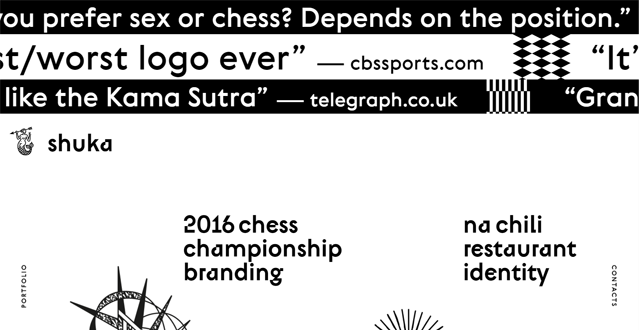
Was this done to create a buzz? If this is the explanation, it would be too early to play that card. Was this a blunder or a clickbait stroke of genius? While the issue is still trending, chess has (once again) become the butt of jokes in mass media.

From FM Albert Chow on Facebook:
It would/should seem obvious to any seasoned observer, that such a brand symbol logo promotional image, by FIDE, would be controversial & criticized, for it’s implied message about appropriate (sexual) rules & boundaries, in the new normal era of the Me Too Movement, where we now know too many authority figures in media-sports-politics-even education, have abused trust being found guilty of “Inappropriate sexual misconduct” = harassment. As any that try to teach to families and schools know, this is the top priority; Safety & respect for rights to not be touched without consent, especially with minors not of consenting age. I myself am almost totally boycotting any that violate the spirit of Me Too, and now that means I must not promote the FIDE World Chess Championship Logo, where in my opinion, contact of hands, legs, and crotch genitals, under the table, by what could be two male teenagers, but in full public view, asks for ridicule and censorship. If I were Magnus, I would be furious, and refuse to play & represent such a possible “perversion”.
People Think The New World Chess Championship Logo Is ‘Pawnographic’
https://www.huffingtonpost.com/entry/world-chess-championship-logo_us_5a3a37c9e4b06d1621b09720
World Championship logo puts chess in ‘odd position’
https://www.espn.com/chess/story/_/id/21823822/world-championship-logo-puts-chess-odd-position
New World Chess Championship Logo Says, “Hey, Let’s Fuck”
https://deadspin.com/new-world-chess-championship-logo-says-hey-lets-fuck-1821443953
The Logo For The 2018 World Chess Championships Does Not Seem To Be About Chess
https://digg.com/2017/world-chess-championship-logo
Chess.com requested a statement from Ilya Merenzon of AGON. Here Merezon discusses the logo in a video after the backlash…
If you go onto World Chess store you can buy their self-proclaimed “Sexy Limited Edition Print” for US$45.00. The site states…